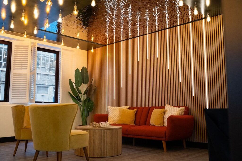
Here’s a bold statement: your brand is the most important thing you’re selling.
Is that a wild exaggeration? Weeellll, maybe. Possibly. But one thing is definitely true: if you present yourself on the phone as Sammy Six Figures, your clients are going to be majorly let down when they walk into your “dumpster-chic” office stylings.
When it comes to office interior design in London, we’ve seen first hand the transformative effect of aligning a workspace to match a company brand. Getting us in doesn’t just mean getting a lick of paint – it means a chance to reinforce a company culture and values. Here’s the facts:
What the Heck is Your Brand Anyway?
When you burst through the CCWS office doors to demand an office refurb, the first thing we’re going to ask is who you are. And then, once we’ve sent security away, we’re going to ask: no, but really, who ARE you?
What is your culture? What are your values? What the heck is your brand? What are your signature colours? Can we see some brand guidelines?
You need to be ready to answer those questions, buddy. Because we’re going to want to hear it from your employees, too. In order to make a workspace that speaks their language, and the language of your brand, we need to understand their perspective.
Your office is the beautiful face of your company, after all. All the choices you make – the colour of lipstick, a lip or nose piercing, a whacking great big forehead tattoo – will tell your clients, visitors and employees a story about your business and how you do things.
Defining client and employee spaces
No matter how banging your brand is, let’s face it: your employees just want a comfortable workspace that gives them a subtle, clear company vision to work towards. What they will not appreciate is a 30 foot company logo hanging from the ceiling that they keep smacking their heads against.
Be clever with your branding. Make it shine where it really counts – where your clients are. Your reception area and boardroom are where you can put the big logo and use those intense colours that wouldn’t work in the areas where your employees are trying to concentrate.
These spaces should speak to how your clients need to perceive you, and be fit out for their comfort. If your clients are Button-up Barrys, don’t force them to sit on bean bags.
Using Nifty Space Planning to Communicate your Culture
The way you lay out your office will massively impact how everyone sees your brand values. If you lock your MD behind a giant iron door, for instance, he may come off a bit like a crazy reclusive dictator.
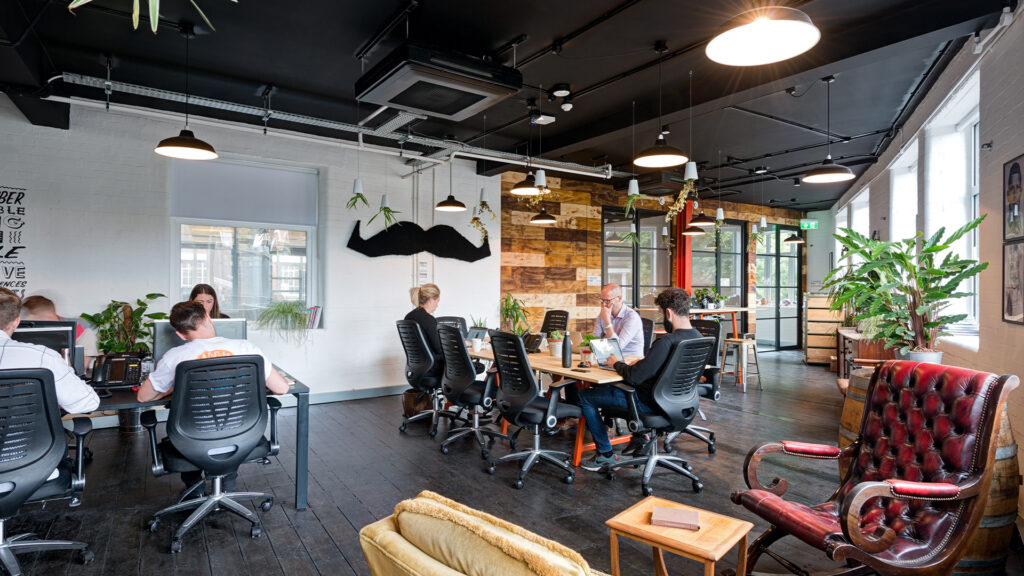
It’s the same with open workspaces. The more walls you take down, and the more breakout spaces you put in, the more emphasis you’re putting on your values of collaboration and communication. Why not stick a mini-golf area in to show off your playful side?
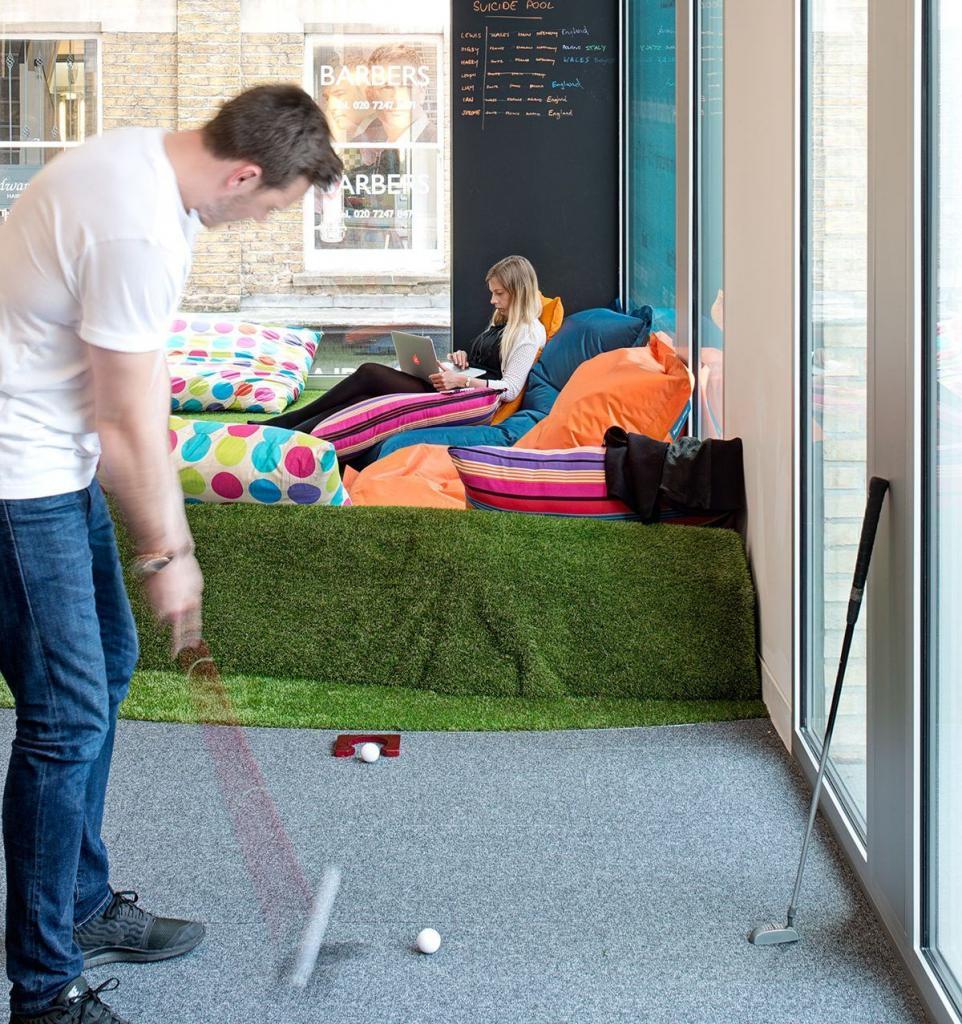
And if it looks like it might be getting a bit too rowdy with golf balls flying into the quiet spaces, let the people who need a bit of focus work behind (reinforced) glass walls. Transparency and cosy nook, all in one.
Making your Brand Work for You
So, here’s the crux: what can you do to communicate your brand, both by shouting it proudly at your clients and whispering it softly to your employees?
Well that’s easy – we’re going to show you.
For our brilliant clients at Movember, they were direct with us: they needed a place that better matched their brand. Well, we think we pulled it out of the bag here, by choosing traditional furniture with a funky twist. If this doesn’t bring to mind a dapper, refined and mustachioed man sipping a hazelnut latte, we don’t know what does:
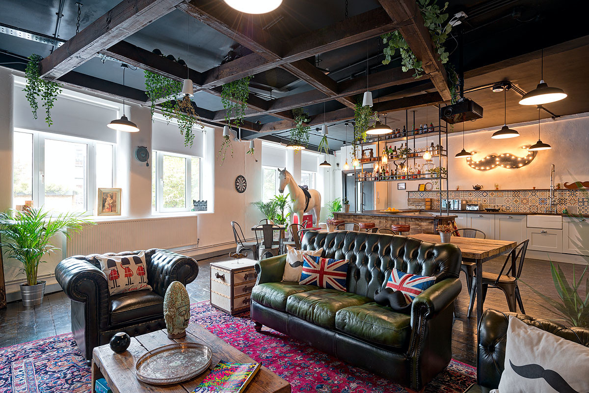
Notice the subtle branding on the wall and cushion? That’s how you play with logos.
Next up is Currency Cloud, whose brand values are all based on collaboration. They loved the bleacher-style seating, long desks and big sofa areas, and we made sure to use their lovely brand colours throughout the office. Imagine the impact this entrance has on their clients:
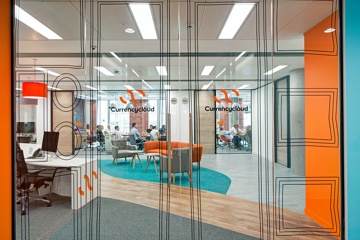
They won’t forget that brand in a hurry.
And finally, Cloudflare. Their brief was tough: attract the very best employees in a super competitive market. They needed us to create a visual representation of the business, dig right into the company brand and expose what Cloudflare actually is and what it does.
Well, we delivered:
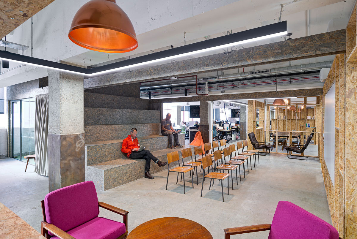
We stripped the space right down and built it from the bones up – creating something utterly unique.
That’s a business that’s not afraid to show off. And as the best office interior design team in London, we can do the same to your brand – get right in there, figure out what makes you tick, and plaster what we find all over the walls. It’s messy, but we love it. Test us out and give us a call


