Interior design might seem like an artistic free-for-all, but beneath the creativity lies a solid foundation of principles that help bring spaces to life.
One such principle – and a favourite among designers – is the 70/30 rule.
It’s simple, versatile, and when applied correctly, it creates that perfect blend of harmony and interest that just feels right.
Whether you’re styling an office break area or a residential lounge, the 70/30 rule offers a clever framework for designing spaces that are both cohesive and characterful.
Let’s take a closer look at what the rule means, why it works, and how you can use it to make your interiors sing.
What Is the 70/30 Rule?
The 70/30 rule is a visual composition technique used to balance unity and contrast within a space. It suggests that 70% of a room’s design should stick to one dominant theme – typically a colour, material, or design style – while the remaining 30% introduces a contrasting element to create interest and depth.
Think of it like a well-tailored outfit: 70% is your sharp suit, while 30% is the bold shoes, statement watch, or colourful scarf that gives the look personality.
In interior design, this translates to your main wall colour, furniture, or layout taking up the majority, and your artwork, accent cushions, lighting or textures adding the spice.
The result? A space that feels curated and balanced, without tipping into either chaos or dullness.
Why It Works
The genius of the 70/30 rule lies in its ability to guide without restricting. It creates a space where the eye has room to rest (thanks to the dominant 70%) but is also drawn in by interest points (the contrasting 30%). Here’s why it consistently delivers:
- Creates Visual Stability: The dominant 70% offers a grounded, calming effect. This is particularly important in commercial interiors, where a sense of focus and professionalism is often required.
- Adds Character: The contrasting 30% gives the space life – it’s what makes a room memorable rather than forgettable. Think a bright yellow meeting room chair against a sea of monochrome, or a textured feature wall in an otherwise sleek, modern boardroom.
- Prevents Overwhelm: Design that’s too neutral can feel bland; too much contrast can feel chaotic. The 70/30 rule strikes that all-important balance.
- Flexibility for Function: Whether you’re fitting out a co-working space, a private office, or a hospitality suite, the principle can be flexed to meet the mood and purpose of the space.
Applying the Rule: Real-World Scenarios
Let’s explore how the 70/30 rule shows up in various design decisions – not just in colour, but across materials, textures, furniture and styling.
1. Colour
This is the most common application of the rule. Use 70% of a dominant colour across the large surfaces – walls, floors, ceilings and big furniture pieces. The remaining 30% can be used for accent tones in soft furnishings, feature walls, artwork or even ceiling fixtures.
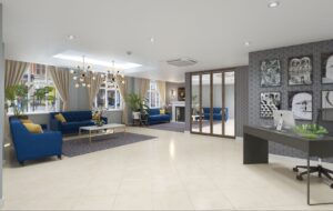
Example: A reception area with warm grey walls, concrete flooring and taupe furniture (70%) paired with mustard cushions, a graphic mural and brass lighting (30%).
2. Style and Theme
You might start with a dominant design language – say, Scandinavian minimalism – and then introduce 30% of another style, like industrial chic or mid-century modern, to break it up.
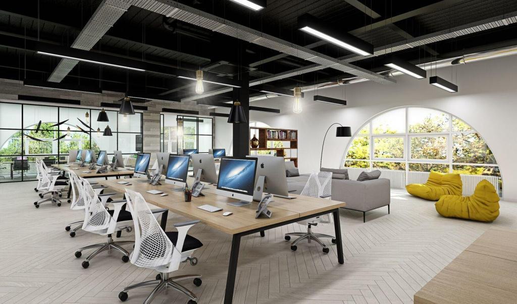
Example: A clean-lined office layout with pale woods and crisp whites (70%) combined with black metal shelving and vintage pendant lighting (30%).
3. Texture and Material
Texture is often underrated but incredibly effective. A space dominated by smooth, sleek finishes (glass, chrome, painted walls) benefits massively from a 30% injection of texture – exposed brick, timber, linen, plants.
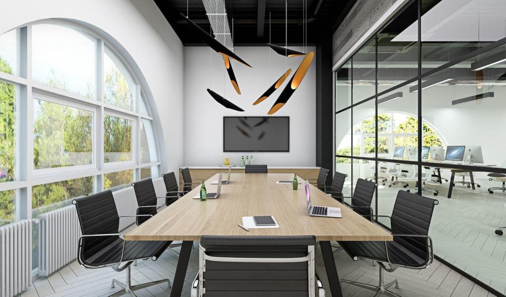
Example: A minimalist boardroom with polished concrete floors and glossy furniture (70%) warmed up with tactile acoustic panels, wood veneer storage and natural-fibre rugs (30%).
4. Furniture Proportions
It also applies to furniture placement. Large pieces like sofas, desks and conference tables make up the dominant 70%, while the 30% is where you bring in smaller items – armchairs, side tables, lamps and decorative pieces.
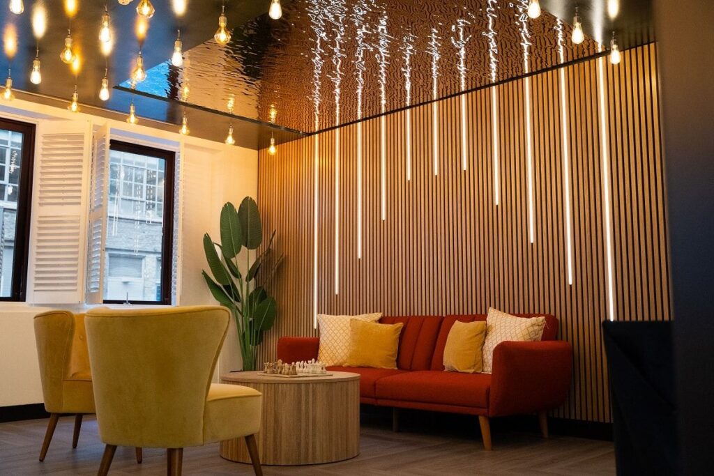
Example: A lounge space with modular seating and a centrepiece coffee table (70%), plus accent stools, hanging lights and quirky side shelves (30%).
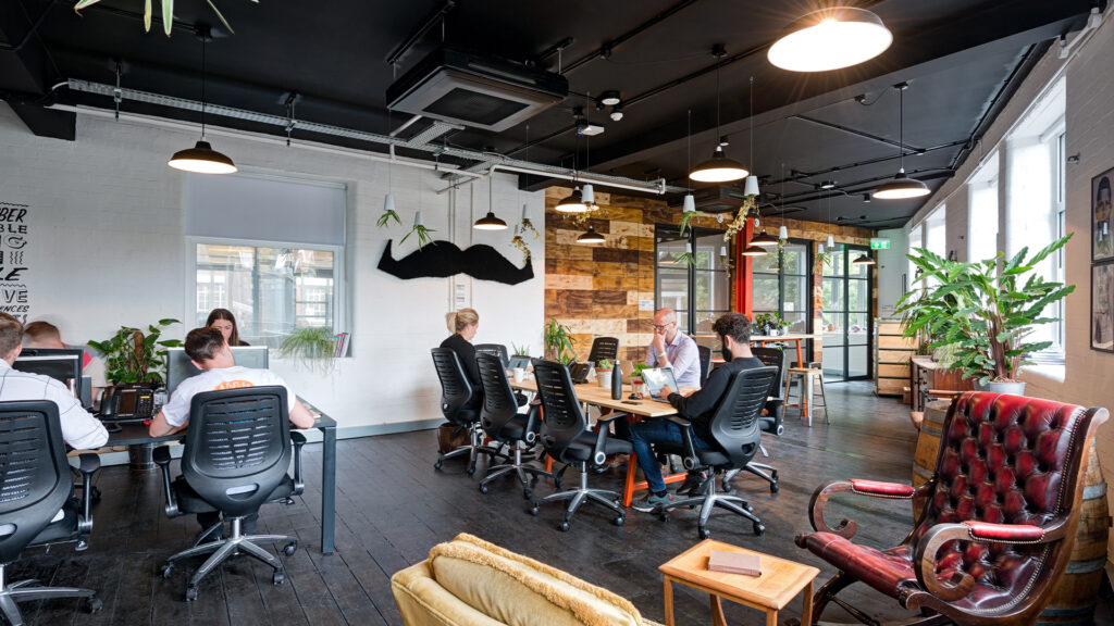
Using It in Office Fit-Outs
At CCWS, we design office spaces that work hard – but that doesn’t mean they need to be boring. The 70/30 rule helps us thread professionalism and brand identity into every room without making it feel like a showroom.
In office interiors, the dominant 70% might be clean, neutral finishes that align with your corporate brand – think white walls, grey carpet tiles and sleek furniture. The 30% is where we weave in bold brand colours, graphic vinyls, art, or playful furniture forms that speak to company culture.
It’s especially effective in:
- Reception Areas: Use 70% corporate calm with 30% visual punch to make a lasting first impression.
- Breakout Spaces: Let the 30% bring a bit of surprise – bold beanbags, textured walls, bright signage.
- Meeting Rooms: Keep it sleek and focused, but avoid monotony with subtle textures or an accent chair.
Tips to Nail the 70/30 Balance
- Start with Your Canvas: Get your walls, floors and ceilings right – they form the visual bulk.
- Layer in Carefully: Introduce accents slowly and be intentional. A bright rug, a statement light, a punchy colour – they should all work together, not compete.
- Play With Ratios: It’s a guide, not a law. In some areas, 60/40 or even 80/20 might work better. Trust your eye.
- Repeat Accents for Cohesion: Echo your 30% touches throughout the space to keep things feeling considered rather than random.
- Consider the Client or Culture: Especially in commercial projects, your accent choices should say something meaningful about the brand, the people, or the purpose of the room.
It’s Clever, Right?
The 70/30 rule is one of those interior design tricks that’s easy to remember but endlessly useful. Whether you’re dressing a home lounge or designing a corporate headquarters, it helps you create spaces that feel balanced, beautiful and full of life.
At CCWS, we believe the best interiors are the ones that speak without shouting – spaces that marry utility with originality. The 70/30 rule is one of the tools that helps us do exactly that. It brings structure to creativity, and creativity to structure.
You might like this guide: Office Design Trends & Predictions.
Frequently Asked Questions
Is the 70/30 rule strict?
No. It’s a guideline, not a formula. You can push and pull the ratio depending on the space, natural light, and your overall goals.
Does it only apply to colour?
Absolutely not. It works across materials, textures, styles, and even furniture sizes.
Can I use multiple accent colours or materials in the 30%?
Yes – the key is making sure they complement each other and don’t crowd the space.
How do I calculate 70% of a room?
Don’t overthink it. You’re aiming for a visual balance – not exact square footage. Step back and ask: does one theme dominate? Is there enough contrast to keep it interesting?
Is it useful in small spaces?
It’s especially useful. Keeping 70% calm and neutral helps a small space feel larger, while the 30% adds personality without cluttering.