Colour theory can be a little like street magic. A suggestion of warm tones here, a lick of paint there, and visitors to your new workspace are giving you their business without a second thought. Even better, with just a little knowledge of the effects of colour on the brain, your employees will be happier, more productive, and springing around the office like new-born lambs.
Trust us, colour theory is an incredible psychological tool. Here’s the tricks of the trade to make your office fit-out in London more Jackson Pollock than jaded prison cell:
How Colour Affects the Brain
Let’s face it, the only difference between the typical office and a jail is that jails don’t have Casual Fridays. The effect of a drab workspace is essentially the same for employees and visitors alike: they don’t want to be there, much less have to be beholden to The Man.
But don’t just take our word for it: a University of Texas study discovered that grey, beige and white offices caused feelings of sadness and depression. The choice of a colour scheme is not only vital for looking cool, but can actually alter how people think.
We get it: everyone is different. Culture, experience, and the way our brains are wired can massively affect our responses to colour. But in the hundreds of studies carried out on this topic, they have found some vital trends:
- Red is a very stimulating colour, and is great in meeting rooms or in areas where people need to work efficiently. However, using it in large amounts is like spiking the water fountain with vodka and Red Bull: everyone will be bouncing off the ceiling, having fistfights and getting nothing done. Use sparingly.
- Yellow is the colour of optimism and creativity. Stick it in collaborative spaces and watch the ideas fly.
- Pink isn’t just for princesses: try a shade more bold than a businessman’s salmon shirt and let the soothing tones flow.
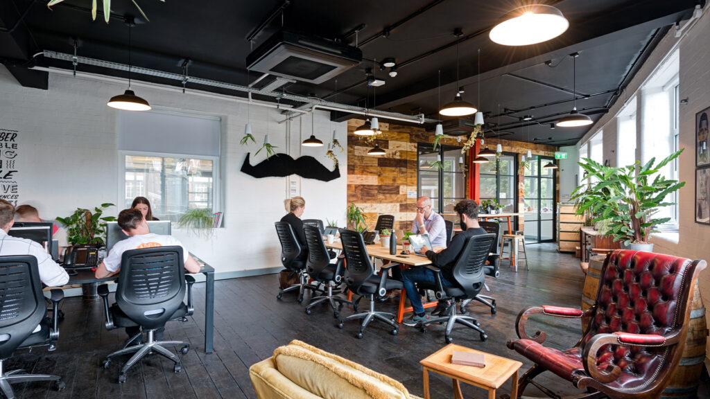
- Green is a brilliant colour for office spaces: calming, friendly, harmonious. When introduced with plants, it’s also one of the best workplace trends out there.
- Orange is like red, but safer for those who get over-stimulated easily. It can also increase appetite, so keep the cakes away.
- Purple is the colour of expense and luxury. Careful when applying it to large areas, unless you typically wander about the office in faux fur coats and demand people refer to you by your “rapper name”.
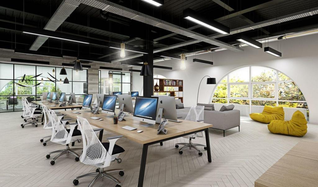
- Blue is another fab all-rounder for calming vibes and productivity highs. It’s low risk, high reward on open-plan spaces. Check out how we splashed the blues around at our Dawson House
Now you can sing a rainbow too.
Defining your Workspaces with Accent Colours
So as you may have noticed, colours are powerful things. Almost too powerful: have you ever wandered into a teenage boy’s bedroom and felt the black walls closing in on you? What about an all-red room that feels like the inside of a sexy serial killer’s house?
This is why accent colours are so effective. They combine the psychological effects of colour with a bit of restraint. And with what you know now about colour theory, you can figure out what each space is meant for just by looking at the tones used.
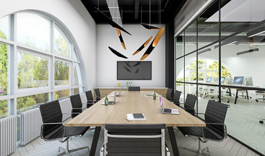
For example, here’s what we did with bright red in a meeting room at Centre for Cities:
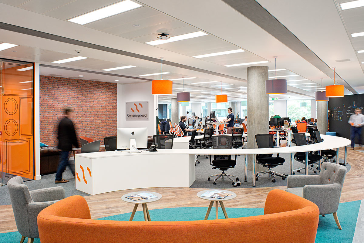
And pairing a bold orange with soothing blue is a killer combination for a breakout space at Currency Cloud:
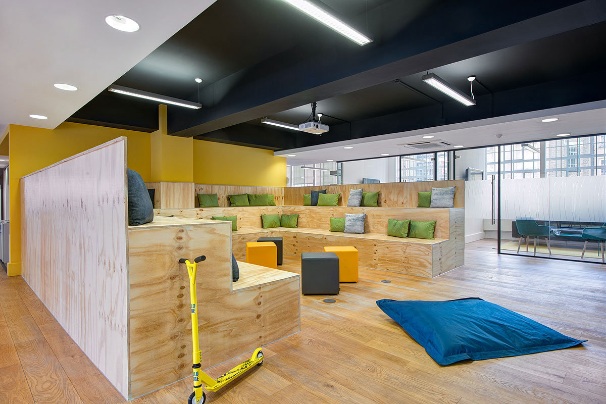
Finally, an energising, happy yellow for a collaboration space at Hakkasan’s office fit-out in London:
Feeling like an expert yet?
Using Colour to Communicate your Brand
It’s all very well practising subtle mind control on everyone (because that’s what you are now – a colour wizard). It’s quite another to create a workspace that reflects and connects everyone to your brand.
Fact is, you want people who walk through your doors to instantly know who you are and what story your brand tells. From an energetic red, to sustainable greens or techy blues, nothing yells brand louder than an incredible reception area. This is the space that leaves a lasting impression, and tells people you brand ain’t nothing to sneer at.
The tempting option is to get a paint bucket of your logo colour and pour it over the reception desk. This method, while fun, won’t communicate your brand as much as carefully selecting from a mixed palette of primary and secondary colours. Go check out your brand guidelines, and figure out from that what colours are likely to really speak to people. After all, this office isn’t just a testing ground for your newly-discovered colour mind games. It’s the beating heart of your company.
As much as it sounds we’ve given away all our colour secrets, this is only the start. The tones, the textures and the pairing of these colours is what makes the difference between a transformative space and a meeting room people pass out in.
We reckon we’ve nailed colour theory by now, but we’re always ready for a challenge. Got a hankering for bubblegum pink or gothic black? Call us and we’ll find a way to make it pop.