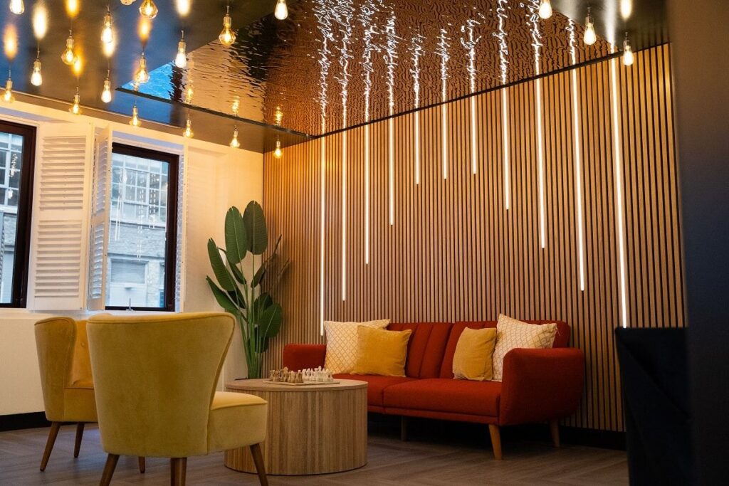
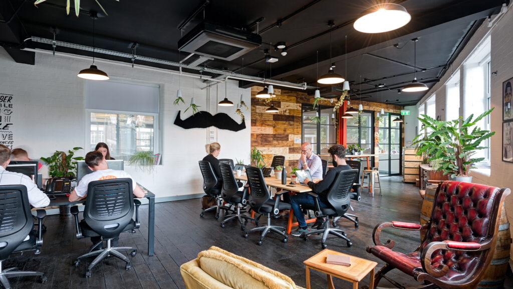
Not sure where to start with your office refurbishment? Here’s how to gather, log and bookmark ‘the design before the design.’
Have you suddenly started noticing the doors in Levi’s changing rooms? Caught yourself checking out the mood lighting instead of your significant other when out for a romantic dinner? Spending hours and hours on Pinterest until you can’t see straight and your head is smoking?
Congratulations, you’re thinking like a designer!
If you’re like us, you have a tendency to find design inspiration everywhere – which is a wonderful trait to have. But inspiration can be such a fleeting thing. Unless you capture and log the thing that caught your eye, there’s a chance it will be lost forever.
That’s where a mood board comes in.
Mood Board Basics
A mood board is a collage of inspiration. It can include just about anything – colours, images, graphics, cloth samples, illustrations, plants, metallics, descriptive words – even noises (bubble wrap, sweet wrappers) or smell (leather, perfume). There are really no limits to the imagination, as long as it tells the story of how you want your office refurbishment to look.
Starting the design process with a mood board is a good idea for two reasons:
1. It helps to organise your thoughts. It’s easy to have your head turned when you’re organising an office refurbishment – there are so many amazing images out there, it’s easy to get distracted and overwhelmed. Mood boarding allows you to heap all your ideas in one place so you can quickly see what goes together and what doesn’t.
2. know what they say about pictures painting a thousand words? Creating a mood board to present to your designer gives her a really clear idea of the direction you want the design to take. It’s one thing to have a bunch of office fit out ideas whirling round your head; it’s quite another to extract that design awesomeness from your brain in a way a designer can understand! A mood board gets you both on the same page.
Now that you have a good grasp of what a mood board is, let’s take a look at how to create one.
Tip #1: Get the right tools
Pinterest is the obvious place for browsing images and creating a quick-and-easy mood board. The big plus is that others will have done a lot of the curating for you, and there’s terrific search functionality to uncover colour palettes and different office fit out ideas that align with what you’re looking to create. The drawback? Pinterest works exclusively for images.
Some people – like us – like to include offline elements in our mood boards; we find that rad mixes of fabrics, textures and so on adds the extra kick. If you’ve gathered some tactile elements, go crazy with the safety scissors and create a collage right there on your desk! It might seem like a ludicrously old-fashioned thing to do, but emotions-wise, it can really spark a reaction. Just be careful with your pinkies on those blades …
Tip #2: Keep your eye on the brand
Interiors don’t happen in isolation. They begin with a vision, based on your culture or brand. Ask yourself, what values does your company signify? Integrity, accountability, teamwork? Passion, diversity, the boss is always right? (Just kidding!) Since we’re looking to create the right vibe for your office refurbishment, it’s a good idea to start with these values and find imagery that matches up. For example, you might include furniture made from sustainable materials if you’re an ethical company, or graphic art and feature walls if your company has a creative culture.
Instead of including specific office fit out ideas, play with images that are more thematic. These images of icons with ‘taches for men’s charity Movember served as their own sort of inspiration board and provided a real jumping off point for our designer. So good. We had to resist the temptation to put these chaps in every room!
Tip #3: Use all your senses
If you’re struggling to come up with office fit out ideas, go for a walk and notice things. Notice the grass in the park, the sky, the clouds and the shrubs. Take photos of concrete, rusty metal, tree bark and other textures that catch your eye. Smell the lavender… and the diesel. What colours and sensations grab you? How do these things make you feel?
Remember, it’s not called a mood board for nothing. Think of the last time you saw a gallery exhibition and it really touched you. When putting together mood boards, you’re trying to create the same sensation. Look at your images as a whole like a painting. Hang them on the wall and go back a few steps. Are your images more than just eye candy? Do they capture the way you’d like your office to feel?
Tip #4: Do more than one
Designers often come up with two or three different concepts for an office design project, so don’t feel you have to restrict yourself to a single mood board. If you’re struggling to choose between a modern look with cool tones and clean lines, or a retro feel with curves and distressed textures, then make a board for both. Remember, you’re only information gathering at this stage. Your designer will help you find the common thread and tie your office fit out ideas together into a cohesive whole.
Tip #5: Add some explanations
If you’re gathering images from the internet to create your mood board, remember to write why exactly you selected a picture. For example, did you like the image composition, the materials, the tonality, the colour palette or simply the first impression? Words are powerful tools. Writing short descriptions on your mood board can help clarify something that your image doesn’t communicate.
Now we’re definitely in the mood(board) – are you ready to give it a go? (Not sorry. Lame puns make us happy!) If you’re not sure where to start, take a look around our Pinterest boards for some inspiration. We can’t wait to see your ideas!
Enjoyed this post? Please share it using the buttons below…


